The best practice today is to have urban streets with no more than three moving lanes (one for each direction of travel and a shared one for turning). The city of Chicago recently rebuilt sidewalks and reconfigured the roadway on a stretch of Broadway in Uptown. Instead of converting some of this overly wide right-of-way to more people-friendly uses, the street gained travel lanes.
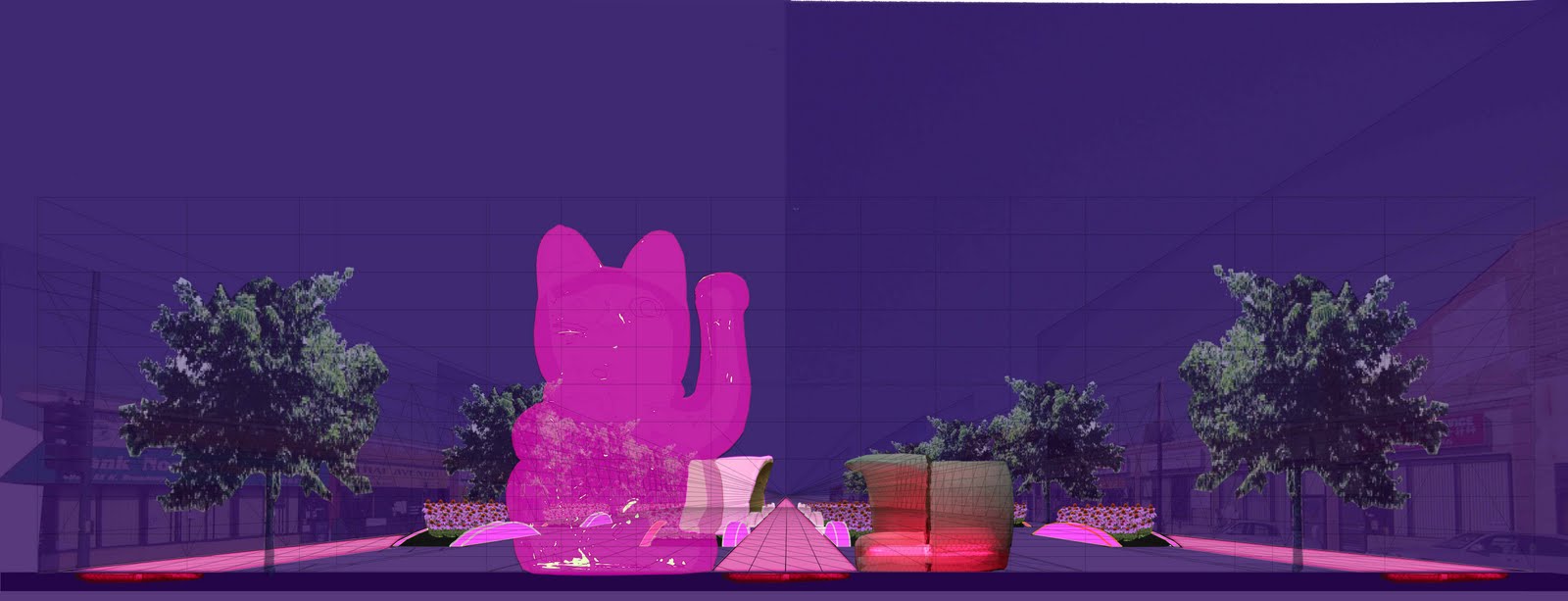
Three lane streets are safer than those with more lanes and can carry about as many motor vehicles. Having more encourages constant lane switching, each maneuver an opportunity for a crash. In the new configuration on Broadway, there are as many as six moving lanes (see middle photo, looking north from Montrose Avenue). Broadway could be Chicago's Lincoln Road (in Miami Beach) or Ramblas (in Barcelona). Limiting the travel lanes to three, one could create a wide median that would have room landscaping, places to sit, and kiosks for small businesses (see the top and bottom images of a proposal for the median at Broadway and Argyle Street). Let's make Broadway a living room, market place, and garden for Uptown.
The W Hotel and Residences (Costas Kondylis & Partners, 2008) is a very nice addition to the Miami Beach waterfront. It continues a long tradition of buildings with windows or balconies angled to capture more of an ocean view (which is to the right in this photo). A notable example of this type was the Americana Hotel (recently demolished) in Bal Harbour by Morris Lapidus. What would otherwise be a relatively simple glass box is made more three-dimensional with an overlaid pattern of extruded concrete rectangles. The W replaces and improves upon an Holiday Inn (which had a charm of its own). The older hotel effectively blocked access to the ocean from 23 Street. While there was a path from Collins Avenue to the beachwalk, the building occupied most of the lot and gave the impression of impermeability. The siting of the W opens up 23 Street, at least visually, east of Collins (see diagram, below). This invites passers by to look for, and find, a way to the ocean. Very nice.
The Wolfsonian-FIU museum is showing Isabella Rossellini's "Green Porno" and "Seduce Me" films. They are wonderful. These short films are clear and humorous summaries of the mating behaviors of different animals (snakes, deer, spiders, etc.).
Visually, the films have spare backgrounds, Ms. Rossellini and perhaps another actor, and a few props. The props appear to be made of construction paper (see photo of a similar object on display at the Wolfsonian) and are both convincing and disarmingly simple in appearance.
In message, Ms. Rossellini makes no effort to have the animals' behavior conform to the myth that the universe consists of the heterosexual couple. The animals are what they are -- hermaphrodites, sex-changers, violent, or sensual. The humor is largely derived from this directness. For example, second-place combatant male deer copulate while a doe (Ms. Rossellini) waits for her turn with the winning buck.
I very much enjoyed this year's Aqua Art Miami show at the Aqua Hotel in Miami Beach. The art was good -- much of it was executed with skill. In addition, a good deal of the enjoyment came from the venue, a hotel in a motel form that surrounds a courtyard (see middle photo of half the hotel and courtyard).
The very feature that makes motels uncomfortable for (non-exhibitionistic) guests is what makes this type of building good for commerce: The primary widows line the passageways. In a motel, this means that guests frequently keep curtains tightly drawn and passers-by avert their eyes.
In a commercial use, looking is encouraged. At the Aqua show, each room housed a gallery. The relationship between the window and the passageways allowed prospective customers to peer into each room and see the inventory, without having to make the commitment to come inside. This increases the chance that someone will become a buyer.
The benefit of this relationship was evidenced numerous times by visitors looking though windows (see top photo of a typical reaction). In some cases, conversations took place through the window, a contemporary version of a Vermeer-like scene (see bottom photo of the window of the room housing the Decorazon gallery).
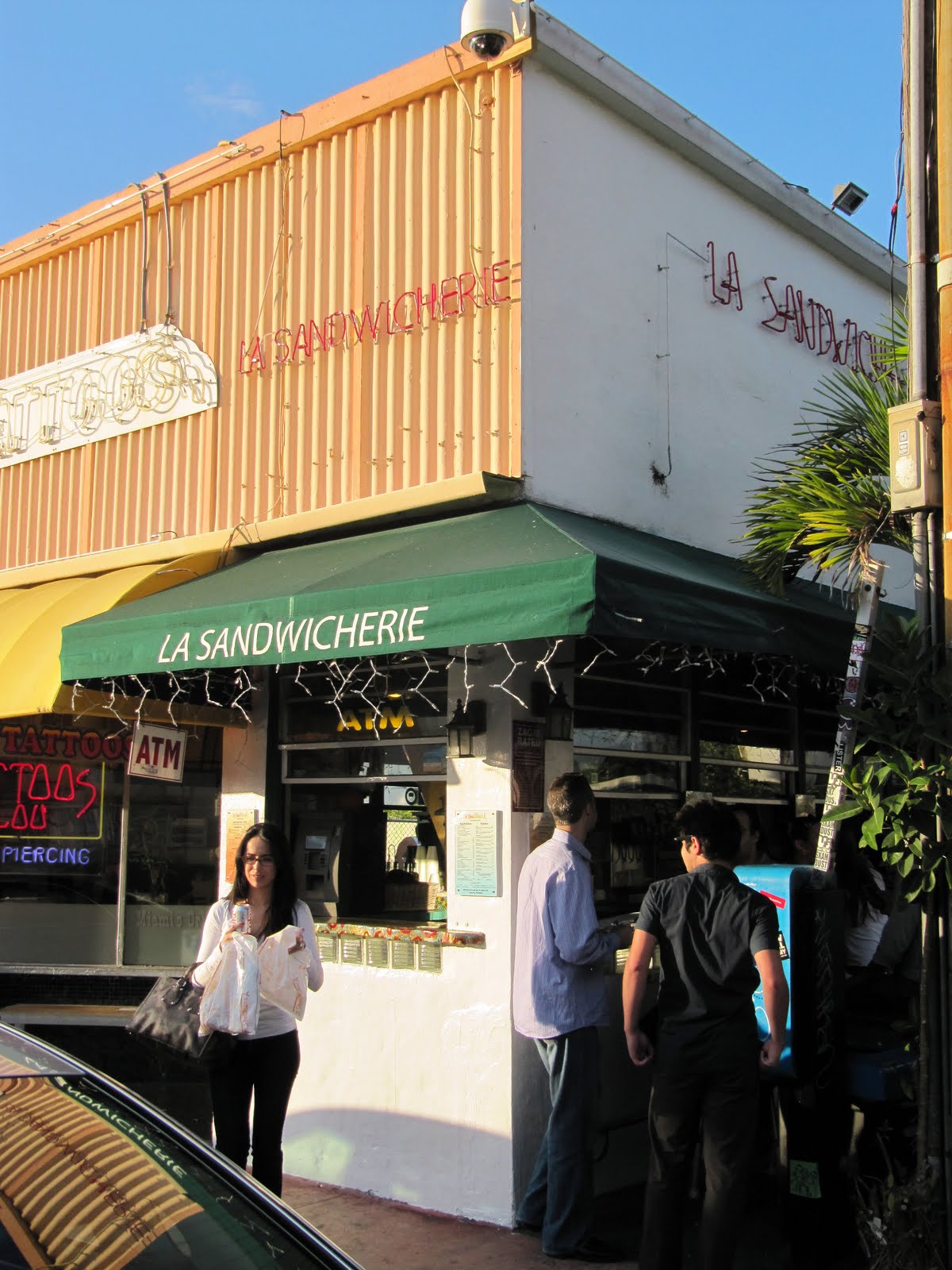
Outdoor eating is rightly believed to enliven a street. Being outside can also make eating more fun for patrons. Miami has a number of eating establishments that take advantage of very small spaces with a variation on a sidewalk cafe. This variation is serving people using a pass-through or having people eat at a counter where the food preparation is done inside and the customer eats outside.
An excellent example is La Sandwicherie, on 14th Street and Collins Court (effectively, an alley that runs parallel to Collins and Washington avenues) in Miami Beach. La Sandwicherie is less than 10 feet deep (see bottom photo of its short side), which includes work space, storage, and a passageway. Patrons sit on stools or stand at the counter, under the protection (if necessary) of an awning (see middle photo).
"Yes, Andrew, this is very nice for a warm climate like Miami's". Yes, Miami's weather (short of the hurricanes) is conducive for this type of restaurant design. However, there is ample evidence that people are willing to eat outdoors in much cooler weather. Just look at the success of cafes in Paris during non-summer months. Find a busy crevice in a temperate climate where people are hungry, and this type of design might work for most of the year.
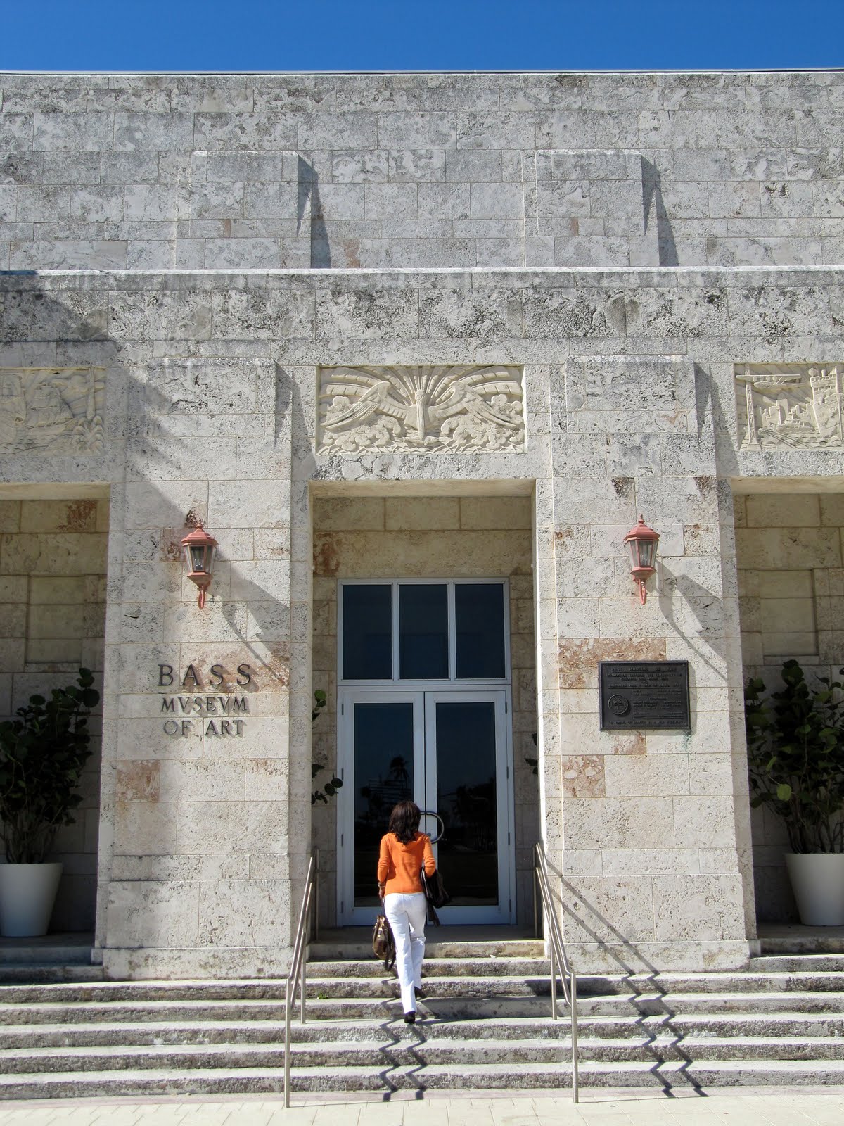
Miami Beach’s Bass Museum of Art has seen some great improvements, in addition to hosting an imposing exhibition of the work of Isaac Julien.The original building was completed in 1930 as the John Collins Memorial Library and ArtCenter (Russell Pancoast was the architect) and terminated an ocean-facing axis within CollinsPark.In 1962, a new library building was constructed between the original and the ocean, blocking this axis.More importantly, the view from Collins Avenue, the main access to the building, was blocked as well.
This began a decades-long front-back crisis for the building.After the library moved, the building was rededicated as the Bass Museum of Art in 1964.But where was its entrance?Facing the back of the new library?Facing Park Avenue, a minor street?In 2000, an addition (designed by Arata Isozaki with Spillis Candela DMJM) attempted to make Park Avenue the main entrance.This entance treatment still did not feel right, since it was small and obscured from the street.
Shortly thereafter, a third library building was constructed next to the park and the axis-blocking second library was demolished. As of this week, just in time for Art Basel Miami Beach, the main entrance for the BassMuseum has been restored to the Collins Avenue side.I was initially worried that the building wouldn’t be able to hold the axis, that it was simply too small.
Seen from Collins Avenue (see second photo from the top), the Bass Museum is large enough to be a pleasant, not overpowering, surprise.There is enough mass to draw the curious pedestrian from his or her path to see the building up close.The bas reliefs and other sculptures surrounding the entrance (by Gustav Bohland) are particular treats (see top, fourth, fifth, and sixth photos).Viewed from the ocean, the BassMuseum is easy to miss (see third photo, with Art Basel installations in the foreground), but this latter vantage point is not as important as the one from the move trafficked Collins.
Coinciding with Art Basel, the BassMuseum has opened a new exhibition of the video and photographic work of Isaac Julien.This is the best art exhibit I have seen at the Bass Museum (http://www.bassmuseum.org/art/isaac-julien-the-creative-caribbean-network/).The short film “Baltimore” (2003) and the multi-screen “Ten Thousand Waves” (2010) are the most engaging parts of the exhibition.
The way the nine screens are arranged in “Ten Thousand Waves” make viewing the entire piece impossible.It is an ingenious way to underscore the complexity of what is being communicated, an interpretation of the lengthy history of the most populous country on Earth.
1111 Lincoln Road in Miami Beach is primarily, at least by square footage, a parking garage. In most instances, this would be a deadly addition to a commercial district. This building, completed this year, is astounding in many ways -- as a work of art, a destination, and as a sensitive part of the urban fabric.
The architectural office of Herzog & de Meuron designed this building as part of a larger project that includes the reuse of the adjacent mid-century modern SunTrust building (originally, Pioneer Bank, completed in 1971, with Ferendino, Grafton, and Pancoast as architects). The SunTrust has windows recessed behind vertically angled "brise soleil", concrete sun shades. This gives the building a very three-dimentional facade, especially for a modern building. It was my fear that the SunTrust would be demolished, given the general change in the area from office to residential and retail uses.
In beautiful contrast to my fear, 1111 Lincoln is a very good companion to its neighbor (see second photo from the top). There is continuity and variation, which is what is often true in good design and needed in an existing urban fabric. The buildings are of about the same volume and material (concrete). However, whereas the SunTrust is white in finish and has uniform floor heights and fenestration, 1111 Lincoln is made of "natural" (relatively unfinished) concrete and has widely varying floor heights and treatments.
1111 Lincoln is also a good host to passers-by. The ground level has retail uses, yes, but also has a feature that is too-little used. There is a projection of significant depth above the first floor that protects pedestrians from the sun and rain (see third photo).
The overhang is one of the features that give 1111 Lincoln a Rio de Janeiro feeling. Superficially, one of the retailers is Rio clothier Osklen and, probably because of its presence, Portuguese can be heard frequently on this block. More importantly, this block is the latest extension to the Lincoln Road mall (also designed by Herzog & de Meuron, with Raymond Jungles), with pedra portuguesa in a stripped-down, black and white Brazilian pattern as pavement (again, see third photo).
Inside, the twists of the facade continue, literally and figuratively. The primary pedestrian entry into the garage leads to a set of stairs, which, in turn, leads upward in helter skelter fashion (see fourth photo). Each floor seems to be a different height, with a different type of ramp design for the cars to get from one to the next level. Then, on the fifth level, in the midst of parking, is a commercial use (note the glass "box" on the left-hand side of the top photo). A fellow visitor also told me there is a rumor of a house having been perched on the roof.
The seventh floor, the top level of parking, has perhaps the best stress-free view in Miami (there are many good views in the city that can be had by posing as a hotel guest or other desirable visitor, but I don't like the pressure). We can all pretend to be looking for our cars when we come upon views of the city, ocean, and bay (see last photo of the view of Miami Beach, with the Port of Miami and downtown in the distance). The roof is supported by a V-shaped column and there is a V-shaped gap in the ceiling, revealing sky. Could all these crotches and "V"s be saying something (see fifth photo)?
1111 Lincoln Road is a great addition to a city rich in architecture. Its beautiful and dramatic spaces have already been used for at least one photo shoot. The seventh floor is currently hosting Intersection Magazine's show for Art Basel Miami Beach. The show is, not surprisingly, car-themed.
Miami Beach has been improving its streets. The city should be applauded and encouraged to do more. "Bulb outs", the narrowing of the roadway at intersections or mid-block, have been added to Alton Road (see bottom photo) and to Indian Creek Drive (see top photo) recently. This is done to reduce crossing distance for pedestrians and speed for motorists
Like most places in the United States, Miami Beach has streets that were designed to move as many motor vehicles as quickly as possible. In some instances, civil roads were remade to achieve this end. The result is a street network that often discourages walking, biking, and general sociability.
Further improvements could be made to Indian Creek and adjacent Collins Avenue. They were probably built as two-way streets. Two-way traffic should be reintroduced and the roadways narrowed. In addition to making these streets safer (because speeds will be reduced), it will also be easier for motorists to get to their destinations.
I would like to wish a happy Hannukah to all my Jewish family, friends, and readers. It is a highlight of my Art Basel Miami Beach trip to see the giant dreidel and menorah displayed on Lincoln Road. Is it kosher for these objects to be made of seashells? Whether or not, or especially if not, they are a Jewish/Florida synthesis that is joyous and humorous. The dreidel and menorah were made by Roger Abramson and the display is sponsored by the Chabad House of Miami Beach.
Since I moved back to Chicago, I've become fascinated with North Sheridan Road, especially the section between Hollywood Avenue (5700 North) and where it turns west (6400 North) in Edgewater. This almost mile-long stretch reminds me of the best and worst of "Condo Canyon" in Miami Beach (the ten blocks of Collins Avenue south of 63 Street): Residential high-rises of varying degrees of whimsy, on a car-centric street, with a squandered waterfront. Let's look at the first part -- Some of these buildings have a high level of good-natured humour, if not outright beauty.
My favorite is a building that a friend and I refer to as "The Sert" because it reminds us of the work of Josep Lluis Sert on Roosevelt Island in New York City (see second photo from the top). This building is the Granville Tower (6166 N. Sheridan Road), designed by Seymour S. Goldstein and completed in 1966.
The Granville Tower is initially notable for two related reasons: Its unique and alternating floor plans, which correspond to the all-duplex apartments within (see top photo). The lower level of each south- and north-facing duplex is cantilevered and angled towards (potential) views of Lake Michigan (see approximation of the floor plan). The upper (bedroom) level's facade is more traditional in its orientation. On the east and west facades, bays (lower level) alternate with (almost) flat facades (upper level) (see third photo).
Socially, the Granville Tower has piqued my interest. It has ties to South Shore, a neighborhood about as far south of downtown as Sheridan Road in Edgewater is to the north. The Granville Tower's rental agent was Harry A. Zisook & Sons, with offices at 1711 E. 71 Street in South Shore.In the 1960s, South Shore changed from a virtually all-white neighborhood to a virtually all-black one. Was the Granville Tower a destination for white people leaving South Shore? For answers to this and other questions (i.e. What is Harry A. Zisook & Sons? Who is the architect, Seymour S. Goldstein? What are the stories of the other buildings in Chicago's Miami Beach?), stay tuned.

 The best practice today is to have urban streets with no more than three moving lanes (one for each direction of travel and a shared one for turning). The city of Chicago recently rebuilt sidewalks and reconfigured the roadway on a stretch of Broadway in Uptown. Instead of converting some of this overly wide right-of-way to more people-friendly uses, the street gained travel lanes.


