
During the day, the building loses the lurid benefit of neon. The Pink Pussycat, however, holds its own. It is bright and colorful in the strong South Florida sun.

 I mean this with no disrespect to the performers involved: Being foolish in public is a public service. Last week I went to the Parlour, a bar in Chicago's Edgewater neighborhood. Part of the entertainment was performances by two women, Rocco Granite and Saucy Cocteau (top and bottom photos, respectively). Rocco's performance was in the vein of drag, with over-the-top emotion. Ms. Cocteau's was a combination exercise video/strip-tease. In every case, I knew I was witnessing something special.

 If life is powered by sugar, sex, and coffee, these images may be close to pornographic.

 A few weeks ago I purchased some white “fun” (i.e. synthetic) fur. It has come in handy in the recent Chicago cold. As a cyclist, I frequently wear a neck gator, effectively just the collar portion of a turtle neck shirt.
 This brings up a recurring question: What should one do with broken souvenirs? I have a collection of small objects that no longer function as they were intended. They end up out of sight, no longer providing the source of inspiration that a souvenir can. In this case, I was able to incorporate it into something else of use, something fun that reminds me of my cousin and Belgrade.
 On a recent wintery day, leaving the Brown Line at Chicago Avenue, I was greeted by the sight at left (view of the east platform). My first reaction was that I was looking at a remarkably colorful and dynamic advertisement. Then I thought it had something to do with Christmas or the upcoming Chinese new year, due to the vibrant red and image on the left panel, which reads like half of an inverted double-happiness character (see middle photo).
  |
| View of West Installation |
 Sometimes humor is intentional. Sometimes it is accidental. I believe that the facade of the Colégio Notre Dame Ipanema, in Rio de Janeiro, falls into the latter category.
 Humor can be a more effective way to get a message across than straightforward text. The image to the left, an appeal for the preservation of animals in Rio de Janeiro, is excellent in many regards. The leopard is eye-catching. It is muscular and menacing. The text to the left, "animals are friends, not food", is both the punch line (Who is eating whom? Can we be cuddly friends?) and poignant. The cat needs our help, if not from literal consumption, then from our voracious destruction of its (and our) home.
 The Gran Plaza in Tikal, Guatemala, is a space that is unusual in many regards. I will mention just two. The first is that it survives, or is revived, as a social space. Tikal is the ruin of a Mayan city that was effectively abandoned in the ninth century. The continuing, albeit limited, use of the Gran Plaza is very interesting. On Christmas day I saw many Guatemalan families (they appeared to be Mayan) picnicking or otherwise relaxing in the Gran Plaza (see the video of groups using this space, http://www.youtube.com/watch?v=fBIz6-XhN5w). Jeff, the friend with whom I was traveling, approached the plaza at a different time that same day. He said that before he got to it, he could hear a hubbub coming from the Gran Plaza.
 The Gran Plaza is defined by two pyramid-shaped temples to the east and west and two complexes of smaller buildings to the north and south. The space between the temples' steps, the part closest to the other, is approximately 200 feet, as is the distance between the rises to the north and south (see the plan of the Gran Plaza, with the defined square highlighted in gray). The temples themselves had risen (there has been more or less loss of height over the last thousand years) almost 150 feet.

 The pyramids of Tikal are composed of three sections (see the first and last photos, of Temple I and Temple II, respectively). The base occupies the lowest part of the pyramid and is the largest section. The actual temple is a much smaller section that sits on top of the base. The top of the pyramid is the roofcomb, which is often taller than the temple.
  Sunday afternoon, the day after Christmas, I saw Antigua's Parque Central in full-force. Hundreds of people were there in the hour before sunset, listening to music, eating food from vendors, and in general seeing and being seen (see a snippet of the crowd listening to a Spanish version of "Jingle Bells", http://www.youtube.com/watch?v=8X7hry4dOtA). This was the Latin American square I had heard about and had not before seen. I returned a few times and the park was always busy (see a video of the park at night, with only Christmas lights for illumination, filled with conversation, http://www.youtube.com/watch?v=4dMBcBmlU-I).


 On Sunday afternoon the entire western edge of the park grounds was lined with food vendors. At other times, there were at least ice cream vendors. These latter would contribute to the aural environment of the square through their bells (see video of the park as seen from the cathedral porch, with the ambient sound of the vendors, http://www.youtube.com/watch?v=iu3u_GW4ClY).


 Guatemala City's bazares navideños, or Christmas markets, are another example of how simple changes to public spaces can make them more sociable. As part of the Paseo de la Sexta project, a decision was made to move street vendors from Sixth Avenue (Avenida Sexta). Since street vendors are often not valued by authorities, I wondered -- Would they have a place where they could succeed and from which the broader community would benefit?
 A few days ago I arrived in Guatemala and have learned of some exceptional public places. The first example is Guatemala City's Paseo de la Sexta, a comfortable and vibrant street (see video, http://www.youtube.com/watch?v=TKA02WwkBz4). It seems this was achieved with relatively simple changes.
 exposure to high-speed traffic.

 The best practice today is to have urban streets with no more than three moving lanes (one for each direction of travel and a shared one for turning). The city of Chicago recently rebuilt sidewalks and reconfigured the roadway on a stretch of Broadway in Uptown. Instead of converting some of this overly wide right-of-way to more people-friendly uses, the street gained travel lanes.
 The W Hotel and Residences (Costas Kondylis & Partners, 2008) is a very nice addition to the Miami Beach waterfront. It continues a long tradition of buildings with windows or balconies angled to capture more of an ocean view (which is to the right in this photo). A notable example of this type was the Americana Hotel (recently demolished) in Bal Harbour by Morris Lapidus. What would otherwise be a relatively simple glass box is made more three-dimensional with an overlaid pattern of extruded concrete rectangles.
 The Wolfsonian-FIU museum is showing Isabella Rossellini's "Green Porno" and "Seduce Me" films. They are wonderful. These short films are clear and humorous summaries of the mating behaviors of different animals (snakes, deer, spiders, etc.).

 I very much enjoyed this year's Aqua Art Miami show at the Aqua Hotel in Miami Beach. The art was good -- much of it was executed with skill. In addition, a good deal of the enjoyment came from the venue, a hotel in a motel form that surrounds a courtyard (see middle photo of half the hotel and courtyard).

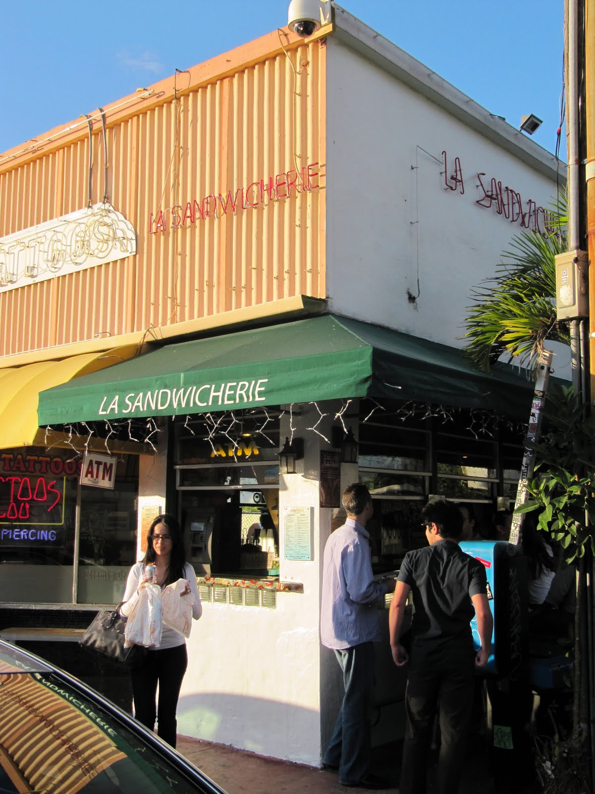 Outdoor eating is rightly believed to enliven a street. Being outside can also make eating more fun for patrons. Miami has a number of eating establishments that take advantage of very small spaces with a variation on a sidewalk cafe. This variation is serving people using a pass-through or having people eat at a counter where the food preparation is done inside and the customer eats outside.
