Monday, December 27, 2010

Guatemala's Rich Public Places -- Tikal's Gran Plaza

The Gran Plaza in Tikal, Guatemala, is a space that is unusual in many regards. I will mention just two. The first is that it survives, or is revived, as a social space. Tikal is the ruin of a Mayan city that was effectively abandoned in the ninth century. The continuing, albeit limited, use of the Gran Plaza is very interesting. On Christmas day I saw many Guatemalan families (they appeared to be Mayan) picnicking or otherwise relaxing in the Gran Plaza (see the video of groups using this space, http://www.youtube.com/watch?v=fBIz6-XhN5w). Jeff, the friend with whom I was traveling, approached the plaza at a different time that same day. He said that before he got to it, he could hear a hubbub coming from the Gran Plaza.

The second way in which it is unusual is physically. The proportions of the square are much different from what I would expect in a US or European city (which is mostly what I have experienced). The volume defined by the structures is more vertical.

The Gran Plaza is defined by two pyramid-shaped temples to the east and west and two complexes of smaller buildings to the north and south. The space between the temples' steps, the part closest to the other, is approximately 200 feet, as is the distance between the rises to the north and south (see the plan of the Gran Plaza, with the defined square highlighted in gray). The temples themselves had risen (there has been more or less loss of height over the last thousand years) almost 150 feet.

(Compare the heights and distances between structures with the Parque Central in Antigua, for example. The latter has four times the surface area of the Gran Plaza and is surrounded mostly by two-story buildings (see http://andrewvesselinovitch.blogspot.com/2010/12/guatemalas-ric
h-public-places-antiguas.html).)

The pyramids of Tikal are composed of three sections (see the first and last photos, of Temple I and Temple II, respectively). The base occupies the lowest part of the pyramid and is the largest section. The actual temple is a much smaller section that sits on top of the base. The top of the pyramid is the roofcomb, which is often taller than the temple.

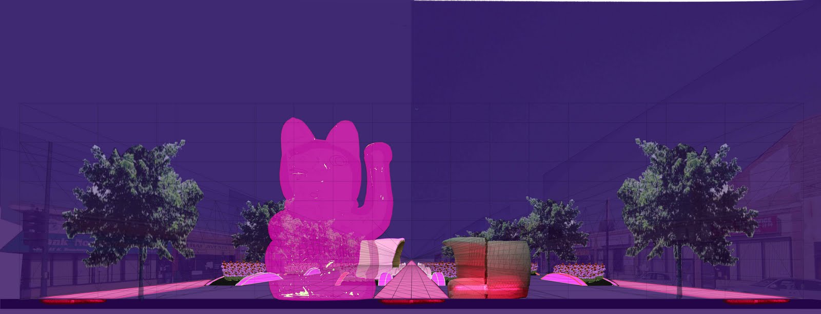
The volume of the plaza may have an unusual cultural (if intentionally done) or poetic (if not) meaning. The base of Temple I is built in nine levels. According to Mayan scholar Mary Ellen Miller
, this "probably refer(s) to the nine levels of the Mesoamerican underworld, where a king would descend to its nadir, only to rise up once again" (Maya Art and Architecture, p. 40). The arrangement of the structures around the Gran Plaza implies, in volume, an inverted base of a pyramid that is as tall as the others, but with a "platform" (the ground) much larger than any of them (see the east-west section through the Gran Plaza and the panoramic photo from the south).

The platform is where the temple rests. If the ground level of the Gran Plaza is the platform of an implied inverted base, the pyramid's "temple" would be underground. The trip to the underworld begins right here, under our feet.


For some of the background material for this post, I must thank two resources: Tikal: Guia de las Antiguas Ruinas Mayas (1971) by William R. Coe; and Maya Art and Architecture (1999), by Mary Ellen Miller.

Sunday, December 26, 2010

Guatemala's Rich Public Places -- Antigua's Parque Central

Sunday afternoon, the day after Christmas, I saw Antigua's Parque Central in full-force. Hundreds of people were there in the hour before sunset, listening to music, eating food from vendors, and in general seeing and being seen (see a snippet of the crowd listening to a Spanish version of "Jingle Bells", http://www.youtube.com/watch?v=8X7hry4dOtA). This was the Latin American square I had heard about and had not before seen. I returned a few times and the park was always busy (see a video of the park at night, with only Christmas lights for illumination, filled with conversation, http://www.youtube.com/watch?v=4dMBcBmlU-I).

What made Parque Central so active? Certainly, Guatemalan society must be predisposed to public socializing. The square also has a number of fine design and programming elements that support its use as a communal living room.

William Whyte, in his observations of public spaces, proposed that a number of elements must be present for them to be successful. These include water, food, seating, and what he called "triangulation", or some sort of attraction that can create a bond between strangers. The Parque Central has these elements.

On Sunday afternoon the entire western edge of the park grounds was lined with food vendors. At other times, there were at least ice cream vendors. These latter would contribute to the aural environment of the square through their bells (see video of the park as seen from the cathedral porch, with the ambient sound of the vendors, http://www.youtube.com/watch?v=iu3u_GW4ClY).

The seating in and around the square is abundant and, in one particular instance, ingenious. The Palacio del Ayuntamiento (city hall), at the east end of the north side of the square, is raised above the park and has a covered arcade in front of it. Both features are exploited for seating.

Within the arcade and against the wall of the building is an almost continuous stone bench. It provides a covered and shaded resting spot from which to watch the activities in the square. To reach the arcade from the street, there are a few steps. Unshaded, but closer to the action in the square, the stairs are also used for seating (see the last two photos).

The triangulation is a bit harder to measure and is, in part, cultural. What may pique one person's interest may be different from another's. On Sunday, in addition to the band and food, there were horse rides available and an itinerant clown. There is also the beauty and the activity of the cathedral, to the east of the park, city hall, and the attraction of the businesses on the north and west sides.

While this spot has been a public place since the founding of Antigua in the 16th century, until the 20th it had been a hardscape. Only in the last century did it acquire vegetation, the most recent incarnation of the park having been executed in the 1990s. The presence of trees for shade, at a minimum, makes the Parque Central a more welcoming place for recreation than it would have been without them.

Whatever its past, the Parque Central is now, though design, commercial use, and cultural attitude towards public recreation, a very successful place. Maybe we can emulate it to create good public places in the United States.

Some of the background information on the park I found in the following two publications: "Antigua Guatemala: The city and Its Heritage", by Elizabeth Bell, and "Antigua: Su Historia, Monumentos, Personajes, Sucedidos y Leyendas", by Rafael Alvarez Polanco.

Guatemala's Rich Public Places -- Bazares Navideños/Christmas Markets

Guatemala City's bazares navideños, or Christmas markets, are another example of how simple changes to public spaces can make them more sociable. As part of the Paseo de la Sexta project, a decision was made to move street vendors from Sixth Avenue (Avenida Sexta). Since street vendors are often not valued by authorities, I wondered -- Would they have a place where they could succeed and from which the broader community would benefit?

The design of the market and its location are very good. As in Paseo de la Sexta, simple and low-cost materials are well-used. The market is defined by banners and brightly-colored fabric suspended from scaffolding. The fabric makes some shade, can be seen from a distance, and becomes a "roof", defining the market space beneath it (see top photo and video, http://www.youtube.com/watch?v=Q-5FaYvRl-U, of the market along 19th Street).

The market also straddles the city's new Transmetro bus station at Plaza Barrios (see bottom photo). Transmetro buses draw passengers because they run faster than traditional Guatemala City ones, in part because the stops are less frequent. This feature concentrates more passengers at fewer stops, giving the market the advantage of having a larger number of people in the vicinity
. The station is also attractive and has a physical presence, unlike typical bus stops, giving the market an added legitimacy.

The answer to my questions is "yes".

Guatemala's Rich Public Places -- Paseo de La Sexta

A few days ago I arrived in Guatemala and have learned of some exceptional public places. The first example is Guatemala City's Paseo de la Sexta, a comfortable and vibrant street (see video, http://www.youtube.com/watch?v=TKA02WwkBz4). It seems this was achieved with relatively simple changes.

Avenida Sexta (Sixth Avenue) in the city's center, Zona 1, is its historic shopping street. Like cities in the United States, it seems to have had some of its energy drained through duplicative retail development at the periphery. The pedestrian in Zona 1 also suffers from narrow sidewalks and
exposure to high-speed traffic.

Avenida Sexta, between 8th and 18th streets, now has a high-quality experience for the pedestrian. Finished this year (see bottom photo of the utility cover, dated 2010), the street has wider sidewalks than the rest in the neighborhood, seating, and public art. Perhaps to mark the Christmas season, white lights were strung overhead for the entire ten-block length (see middle photo). At regular intervals are banners explaining particular improvements around the city or points of interest (see top photo, introducing new Christmas markets). While there is a marked bus lane, Avenida Sexta was open only to pedestrians the times I was there.

The project's name, "Paseo", indicates that the changes to Avenida Sexta are an attempt make this street more sociable. The improvements are about walking, being seen, and interacting with fellow residents and visitors. This was one of the most vibrant places I saw in the capital. It was the most happy.

Tuesday, December 21, 2010

Make Chicago's Broadway More Social -- Remove Lanes and Add Landscaping, Seating, and Kiosks

The best practice today is to have urban streets with no more than three moving lanes (one for each direction of travel and a shared one for turning). The city of Chicago recently rebuilt sidewalks and reconfigured the roadway on a stretch of Broadway in Uptown. Instead of converting some of this overly wide right-of-way to more people-friendly uses, the street gained travel lanes.

Three lane streets are safer than those with more lanes and can carry about as many motor vehicles. Having more encourages constant lane switching, each maneuver an opportunity for a crash. In the new configuration on Broadway, there are as many as six moving lanes (see middle photo, looking north from Montrose Avenue).

Broadway could be Chicago's Lincoln Road (in Miami Beach) or Ramblas (in Barcelona). Limiting the
travel lanes to three, one could create a wide median that would have room landscaping, places to sit, and kiosks for small businesses (see the top and bottom images of a proposal for the median at Broadway and Argyle Street). Let's make Broadway a living room, market place, and garden for Uptown.

Thursday, December 9, 2010

No Longer "Live" from Art Basel Miami Beach -- The W Hotel Opens up the Ocean

The W Hotel and Residences (Costas Kondylis & Partners, 2008) is a very nice addition to the Miami Beach waterfront. It continues a long tradition of buildings with windows or balconies angled to capture more of an ocean view (which is to the right in this photo). A notable example of this type was the Americana Hotel (recently demolished) in Bal Harbour by Morris Lapidus. What would otherwise be a relatively simple glass box is made more three-dimensional with an overlaid pattern of extruded concrete rectangles.

The W replaces and improves upon an Holiday I
nn (which had a charm of its own). The older hotel effectively blocked access to the ocean from 23 Street. While there was a path from Collins Avenue to the beachwalk, the building occupied most of the lot and gave the impression of impermeability. The siting of the W opens up 23 Street, at least visually, east of Collins (see diagram, below). This invites passers by to look for, and find, a way to the ocean. Very nice.

Monday, December 6, 2010

"Live" from Art Basel Miami Beach -- Isabella Rossellini's Straight-Shooting Films at the Wolfsonian

The Wolfsonian-FIU museum is showing Isabella Rossellini's "Green Porno" and "Seduce Me" films. They are wonderful. These short films are clear and humorous summaries of the mating behaviors of different animals (snakes, deer, spiders, etc.).

Visually, the films have spare backgrounds, Ms. Rossellini and perhaps another actor, and a few props. The props appear to be made of construction paper (see photo of a similar object on display at the Wolfsonian) and are both convincing and disarmingly simple in appearance.

In message, Ms. Rossellini makes no effort to have the animals' behavior conform to the myth that the universe consists of the heterosexual couple. The animals are what they are -- hermaphrodites, sex-changers, violent, or sensual. The humor is largely derived from this directness. For example, second-place combatant male deer copulate while a doe (Ms. Rossellini) waits for her turn with the winning buck.

Sunday, December 5, 2010

"Live" from Art Basel Miami Beach -- Courtyard Motels Make Great Galleries

I very much enjoyed this year's Aqua Art Miami show at the Aqua Hotel in Miami Beach. The art was good -- much of it was executed with skill. In addition, a good deal of the enjoyment came from the venue, a hotel in a motel form that surrounds a courtyard (see middle photo of half the hotel and courtyard).

The very feature that makes motels uncomfortable for (non-exhibitionistic) guests is what makes this type of building good for commerce: The primary widows line the passageways. In a motel, this means that guests frequently keep c
urtains tightly drawn and passers-by avert their eyes.

In a commercial use, looking is encouraged. At the Aqua show, each room housed a gallery. The relationship between the window and the passageways allowed prospective customers to peer into each room and see the inventory, without having to make the commitment to come inside. This increases the chance that someone will become a buyer.

The benefit of this relationship was evidenced numerous times by visitors looking though windows (see top photo of a typical reaction). In some cases, conversations took place through the window, a contemporary version of a Vermeer-like scene (see bottom photo of the window of the room housing the Decorazon gallery).


"Live" from Art Basel Miami Beach -- "Pass-Through" Dining Enlivens the Street

Outdoor eating is rightly believed to enliven a street. Being outside can also make eating more fun for patrons. Miami has a number of eating establishments that take advantage of very small spaces with a variation on a sidewalk cafe. This variation is serving people using a pass-through or having people eat at a counter where the food preparation is done inside and the customer eats outside.

An excellent example is La Sandwicherie, on 14th Street and Collins Court (effectively, an alley that runs parallel to Collins and Washington avenues) in Miami Beach. La Sandwicherie is less than 10 feet deep (see bottom photo of its short side), which includes work space, storage, and a passageway. Patrons sit on stools or stand at the counter, under the protection (if necessary) of an awning (see middle photo).

"Yes, Andrew, this is very nice for a warm climate like Miami's". Yes, Miami's weather (short of the hurricanes) is conducive for this type of restaurant design. However, there is ample evidence that people are willing to eat outdoors in much cooler weather. Just look at the success of cafes in Paris during non-summer months. Find a busy crevice in a temperate climate where people are hungry, and this type of design might work for most of the year.

Saturday, December 4, 2010

"Live" from Art Basel Miami Beach -- The Bass Museum of Art (re) Gains an Entrance and Hosts a Great Isaac Julien Show

Miami Beach’s Bass Museum of Art has seen some great improvements, in addition to hosting an imposing exhibition of the work of Isaac Julien. The original building was completed in 1930 as the John Collins Memorial Library and Art Center (Russell Pancoast was the architect) and terminated an ocean-facing axis within Collins Park. In 1962, a new library building was constructed between the original and the ocean, blocking this axis. More importantly, the view from Collins Avenue, the main access to the building, was blocked as well.

This began a decades-long front-back crisis for the building. After the library moved, the building was rededicated as the Bass Museum of Art in 1964. But where was its entrance? Facing the back of the new library? Facing Park Avenue, a minor street? In 2000, an addition (designed by Arata Isozaki with Spillis Candela DMJM) attempted to make Park Avenue the main entrance. This entance treatment still did not feel right, since it was small and obscured from the street.


Shortly thereafter, a third library building was constructed next to the park and the axis-blocking second library was demolished. As of this week, just in time for Art Basel Miami Beach, the main entrance for the Bass Museum has been restored to the Collins Avenue side. I was initially worried that the building wouldn’t be able to hold the axis, that it was simply too small.


Seen from Collins Avenue (see second photo from the top), the Bass Museum is large enough to be a pleasant, not overpowering, surprise. There is enough mass to draw the curious pedestrian from his or her path to see the building up close. The bas reliefs and other sculptures surrounding the entrance (by Gustav Bohland) are particular treats (see top, fourth, fifth, and sixth photos). Viewed from the ocean, the Bass Museum is easy to miss (see third photo, with Art Basel installations in the foreground), but this latter vantage point is not as important as the one from the move trafficked Collins.


Coinciding with Art Basel, the Bass Museum has opened a new exhibition of the video and photographic work of Isaac Julien. This is the best art exhibit I have seen at the Bass Museum (http://www.bassmuseum.org/art/isaac-julien-the-creative-caribbean-network/). The short film “Baltimore” (2003) and the multi-screen “Ten Thousand Waves” (2010) are the most engaging parts of the exhibition.


The way the nine screens are arranged in “Ten Thousand Waves” make viewing the entire piece impossible. It is an ingenious way to underscore the complexity of what is being communicated, an interpretation of the lengthy history of the most populous country on Earth.

Thursday, December 2, 2010

"Live" from Art Basel Miami Beach -- Herzog & de Meuron's Artful Parking Garage

1111 Lincoln Road in Miami Beach is primarily, at least by square footage, a parking garage. In most instances, this would be a deadly addition to a commercial district. This building, completed this year, is astounding in many ways -- as a work of art, a destination, and as a sensitive part of the urban fabric.

The architectural office of Herzog & de Meuron designed this building as part of a larger project that includes the reuse of the adjacent mid-century modern SunTrust building (originally, Pioneer Bank, completed in 1971, with Ferendino, Grafton, and Pancoast as architects). The SunTrust has windows recessed behind vertically angled "brise soleil", concrete sun shades. This gives the building a very three-dimentional facade, especially for a modern building. It was my fear that the SunTrust would be demolished, given the general change in the area from office to residential and retail uses.

In beautiful contrast to my fear, 1111 Lincoln is a very good companion to its neighbor (see second photo from the top). There is continuity and variation, which is what is often true in good design and needed in an existing urban fabric. The buildings are of about the same volume and material (concrete). However, whereas the SunTrust is white in finish and has uniform floor heights and fenestration, 1111 Lincoln is made of "natural" (relatively unfinished) concrete and has widely varying floor heights and treatments.

1111 Lincoln is also a good host to passers-by. The ground level has retail uses, yes, but also has a feature that is too-little used. There is a projection of significant depth above the first floor that protects pedestrians from the sun and rain (see third photo).

The overhang is one of the features that give 1111 Lincoln a Rio de Janeiro feeling. Superficially, one of the retailers is Rio clothier Osklen and, probably because of its presence, Portuguese can be heard frequently on this block. More importantly, this block is the latest extension to the Lincoln Road mall (also designed by Herzog & de Meuron, with Raymond Jungles), with pedra portuguesa in a stripped-down, black and white Brazilian pattern as pavement (again, see third photo).

Inside, the twists of the facade continue, literally and figuratively. The primary pedestrian entry into the garage leads to a set of stairs, which, in turn, leads upward in helter skelter fashion (see fourth photo). Each floor seems to be a different height, with a different type of ramp design for the cars to get from one to the next level. Then, on the fifth le
vel, in the midst of parking, is a commercial use (note the glass "box" on the left-hand side of the top photo). A fellow visitor also told me there is a rumor of a house having been perched on the roof.

The seventh floor, the top level of parking, has perhaps the best stress-free view in Miami (there are many good views in the city that can be had by posing as a hotel guest or other desirable visitor, but I don't like the pressure). We can all pretend to be looking for our cars when we come upon views of the city, ocean, and bay (see last photo of the view of Miami Beach, with the Port of Miami and downtown in the distance). The roof is supported by a V-shaped column and there is a V-shaped gap in the ceiling, revealing sky. Could all these crotches and "V"s be saying something (see fifth photo)?

1111 Lincoln Road is a great addition to a city rich in architecture. Its beautiful and dramatic spaces have already been used for at least one phot
o shoot. The seventh floor is currently hosting Intersection Magazine's show for Art Basel Miami Beach. The show is, not surprisingly, car-themed.

"Live" from Art Basel Miami Beach -- Miami Beach Makes its Roads (a Little) More Friendly

Miami Beach has been improving its streets. The city should be applauded and encouraged to do more. "Bulb outs", the narrowing of the roadway at intersections or mid-block, have been added to Alton Road (see bottom photo) and to Indian Creek Drive (see top photo) recently. This is done to reduce crossing distance for pedestrians and speed for motorists

Like most places in the United States, Miami Beach has streets that were designed to move as many motor vehicles as quickly as possible. In some instances, civil roads were remade to achieve this end. The result is a street network that often discourages walking, biking, and general sociability.

Further improvements could be made to Indian Creek and adjacent Collins Avenue. They were probably built as two-way streets. Two-way traffic should be reintroduced and the roadways narrowed. In addition to making these streets safer (because speeds will be reduced), it will also be easier for motorists to get to their destinations.

"Live" from Art Basel Miami Beach -- Happy Hannukah with Shell-Covered Accessories!

I would like to wish a happy Hannukah to all my Jewish family, friends, and readers. It is a highlight of my Art Basel Miami Beach trip to see the giant dreidel and menorah displayed on Lincoln Road. Is it kosher for these objects to be made of seashells? Whether or not, or especially if not, they are a Jewish/Florida synthesis that is joyous and humorous. The dreidel and menorah were made by Roger Abramson and the display is sponsored by the Chabad House of Miami Beach.